
As a fintech product grows, inconsistencies start piling up between screens designed by different teams at different times: different button styles, different colour tones, different spacing rules. That inconsistency is not just an aesthetic problem — it is a signal of quality that affects user trust.
A design system is the set of components, rules and principles that lets design and development teams work in a shared language and prevents that drift. A well-built design system speeds up both design and development considerably.
In this guide we cover how to build a design system for a fintech product, which components to start with, and how to keep it sustainable.
Why Do You Need a Design System?
For a small product team, design consistency can be maintained informally. But as the team grows and the number of projects running in parallel increases, keeping things consistent without a shared reference becomes nearly impossible.
In fintech products, consistency matters not only aesthetically but for perceived trust. A confirm button that looks different on different screens creates confusion and doubt.
A design system also speeds up onboarding for new team members; instead of learning everything from scratch, a new designer or developer can draw on the existing component library and become productive quickly.
The Foundations: Colour, Typography, Spacing
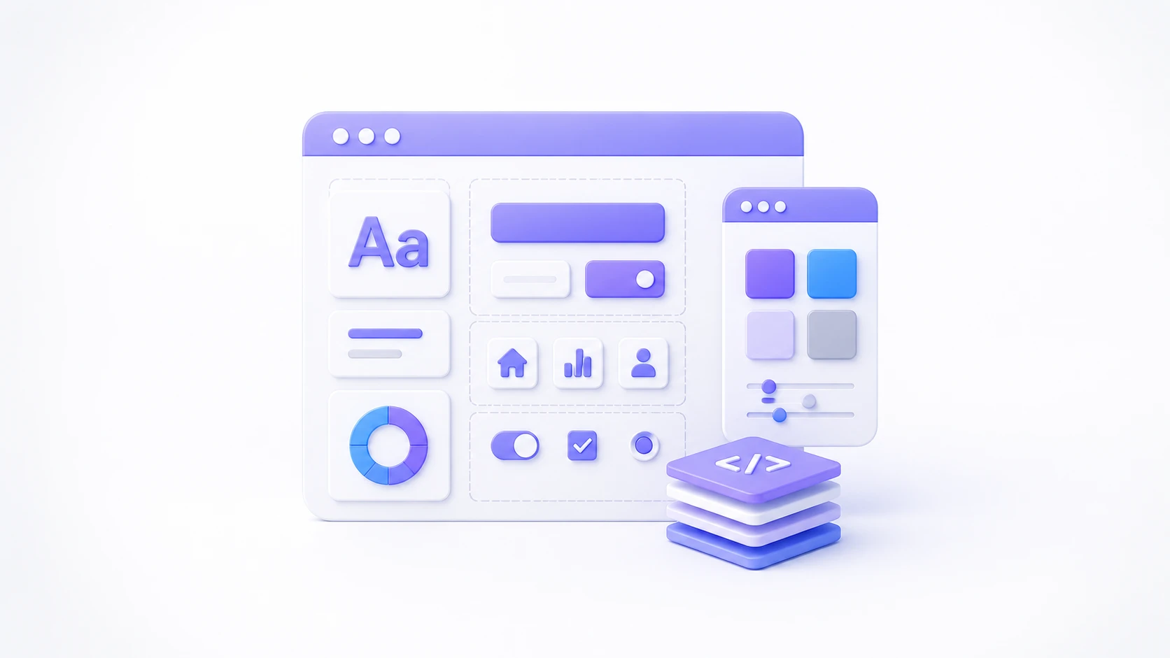
The foundation of a design system is laid with "design tokens" — a colour palette, a typography scale and spacing rules. These tokens should be defined with the same names in both the design tool and the codebase.
The colour palette should define not only brand colours but semantic ones for success, error and warning; this gives you a consistent visual language for financial status messages in particular (successful transaction, failed transaction).
Keeping the typography scale to a limited number of steps (five or six sizes, say) stops designers inventing a new font size every time and preserves the discipline of the system.
How to Prioritize the Component Library
Rather than trying to build every component at once, starting with the most frequently used and highest-impact ones (button, form field, card, notification) gets the design system producing value quickly.
Components specific to fintech products — an amount entry field, a transaction status indicator, a security verification component — won't exist in a generic design system template; they have to be designed specifically for the sector's needs.
Every state of a component (default, hover, active, disabled, error) should be defined from the outset; states added later risk breaking the system's consistency.
Keeping Design and Code in Sync
One of the biggest risks to a design system is the components in the design tool (Figma, for example) and those in the codebase drifting apart over time. Regular synchronization processes are needed to prevent this.
Tools that push design tokens into code automatically make that synchronization far easier and remove the errors of a manual process.
Defining ownership of the design system clearly (who can add a new component, who approves it) prevents it from growing scattered and inconsistent over time.
Sustainability: A Design System Is a Product, Not a Project
Design systems are often treated as one-off projects and neglected once built. In reality a design system is a product with its own users — designers and developers — and it needs continuous maintenance.
Tracking the system's adoption rate (how many screens use its components) is a concrete metric showing how genuinely it has been taken up.
Regular feedback collection lets the system evolve around real user needs; without it, the system risks becoming a theoretical structure disconnected from what people actually need.
Common Mistakes and How to Avoid Them
A common mistake is building the design system in isolation with one person or a small team, without involving the rest of the product teams; the system then ends up out of step with real needs.
Another is neglecting documentation; when it isn't written down clearly when and how a component should be used, teams apply their own interpretations and use components incorrectly.
Frequently Asked Questions
Where should you start when building a design system?
Starting with the most frequently used basics — buttons, form fields, colour and typography tokens — delivers fast, measurable first value.
Does a small team need a full design system?
For small teams a simple style guide may be enough; a full design system usually creates value for growing teams running several projects in parallel.
What tools are used to build a design system?
Using design tools such as Figma alongside component libraries in the codebase (Storybook in a React-based system, for instance) is a common approach.
How often should a design system be updated?
Rather than a fixed calendar, keep the system alive with regular small updates as new needs and user feedback accumulate.
Conclusion
The design systems SameUp builds with its fintech clients are positioned as a long-term investment that speeds up both design and development.
If you would like to build a design system for your own product, or review the one you have, we can arrange an assessment session with the SameUp team.