
The moment a user downloads an app, their relationship with the brand begins. That first contact can decide a product's fate, especially in a vertical as competitive as music. Spotify's onboarding is a good example: it communicates the value proposition clearly and guides the user into a personalized experience. But like any strong system, it has room to improve.
Onboarding does not begin the moment you open the app; in Spotify's case it starts on the store page. A clear message like "Music, Podcasts and Audiobooks on One Platform" shapes user expectations at the very first screen. This approach carries onboarding beyond the boundaries of the app and puts the brand's value proposition on stage early.

The welcome screen
A clean interface carrying a single message:
"Millions of songs. Free on Spotify."
You have two options: Sign up free and Log in.
When the app opens, the user is met not by unnecessary detours or complex screens but by a simple entry screen carrying the value message directly. Sign-in and sign-up options are flexible (email, phone, social), and the instant feedback the system gives during data entry keeps things moving. The user feels less like they are "filling in a form" and more like they are "starting an experience".
That said, asking for details such as date of birth and gender this early can leave some users wondering why it is necessary. Where and how questions like these sit within onboarding has a direct effect on perceived trust.
Choosing your artists
Before you reach the home screen, Spotify asks you to pick at least three artists you like.
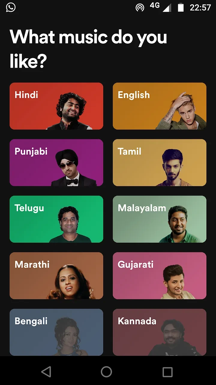
Spotify folds user preferences into the onboarding flow naturally. Visual selection screens for genres and artists bring the user into the process actively rather than passively. Within the first few minutes, a new user is already laying the groundwork for a personal experience. The key point in this section: preferences are presented as guidance, not as a requirement.
The purpose of onboarding is to get the user to the product's core value as quickly as possible. Spotify does this well. After a few steps, the user can play their first song. That early interaction speeds up the emotional bond with the product. "I'm here to listen to music" stops being an empty promise and turns immediately into experience.
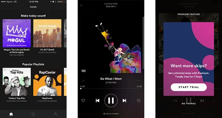
The timing of Premium offers
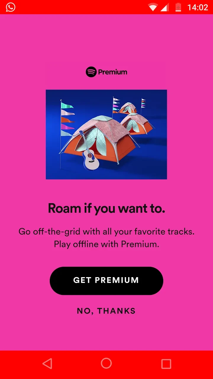
Spotify shows its Premium offer quite early in onboarding. This does not work well for every user. Showing an upsell to someone who has not yet experienced the product's value can interrupt the flow. Spotify does close that gap later on, presenting Premium offers again from inside the experience — at the moment the user has grasped what the system is worth.
From form validation to transition animations, giving the user clear feedback at every stage keeps the flow unbroken. These small touches turn onboarding from a series of form screens into something that feels alive.
Design principles worth learning
The Spotify example lays out the core principles of a well-built onboarding process clearly:
- The value message should be clear and repeated from the store screen onward.
- Sign-in and data collection steps should be as few, as combined and as responsive as possible.
- Personalization should guide the user, not force them.
- The user should reach the core value in as little time as possible.
- Upsell offers should come after the product's value has been experienced.
- Micro-interactions should keep the user informed at every step.
Weak points and room for improvement
Pushing the upsell too early
If a new user meets a Premium offer before experiencing the app's core value, it can provoke resistance. Offers like this land better after the "value hook".
Privacy perception and data requests
Details such as date of birth and gender can create resistance, particularly when asked for without a stated reason.
Screen management and step splitting
Some steps are separated unnecessarily; combining the name and date-of-birth screens has been suggested, for instance.
Search and category interaction problems
There are UX traps, such as search disappearing once a category is selected. User control is limited in ways they don't expect.
An upsell that arrives too early rather than too late
Presenting the Premium offer too soon can damage the user's first experience.
Spotify's onboarding flow is not flawless, but it is instructive. It puts the value proposition on stage early, brings the user into the process actively, and minimizes the time it takes to reach the core experience. At the same time, small adjustments to the early upsell attempts and the data collection steps could make the user flow stronger still.